Since the debut of the Apple iPad, app-maker TouchPress has been leading the reinvention of digital publishing. Most of their titles start from texts such as a novel or a collection of poems and enhance them with plentiful multimedia content to produce elegantly crafted hypertextual publications.
TouchPress’ latest app The Orchestra is an interactive tour of the orchestra and orchestral music; an ambitious project that required TouchPress to engage with two worlds of the classical music industry. They partnered with the Philarmonia Orchestra for recording audio and video, and with The Music Sales Group to engrave the digital scores.
The main section of the app presents excerpts of eight orchestral pieces, with three HD videos coordinated with the score. One camera is always on Esa-Pekka Salonen, the conductor. His composed conducting style works well with this frontal camera, which gives the user/listener an unusual point of view and insight on the conductor’s role. Other videos are also edited to showcase the modus operandi of the orchestra by focusing on the dominant instruments, or by showing the whole group from the top.
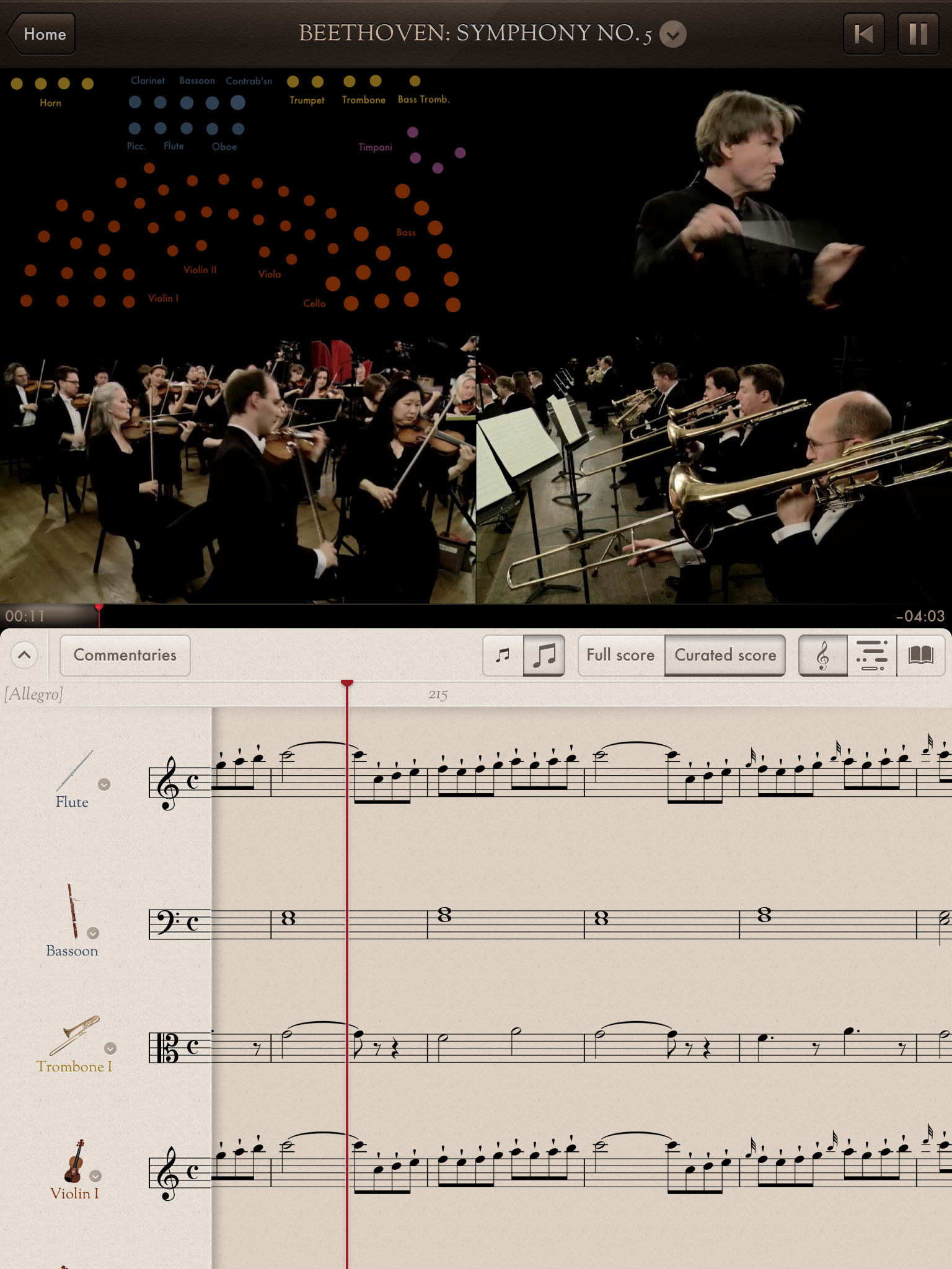
A special diagram show each instrument in the orchestra as a dot that pulses when the instrument plays. Each section of instruments (and of dots) can be made louder by holding a finger on the corresponding area of the diagram, effectively giving an idea of how the sound would change by physically moving through the orchestra (for most pieces this is only available after an in-app purchase, forced by the 2GB size limit that Apple sets for each app).
The score is displayed at the bottom and is coordinated with the audio. A vertical bar marks the notes being played and the score scrolls together with the performance with good precision (things get occasionally a bit less precise in Salonen’s own Violin Concerto, which combines frequent tempo changes with the relative autonomy of the solo violin). The score acts as a control system for the user/listener to hold, scroll back or forward the whole apparatus.
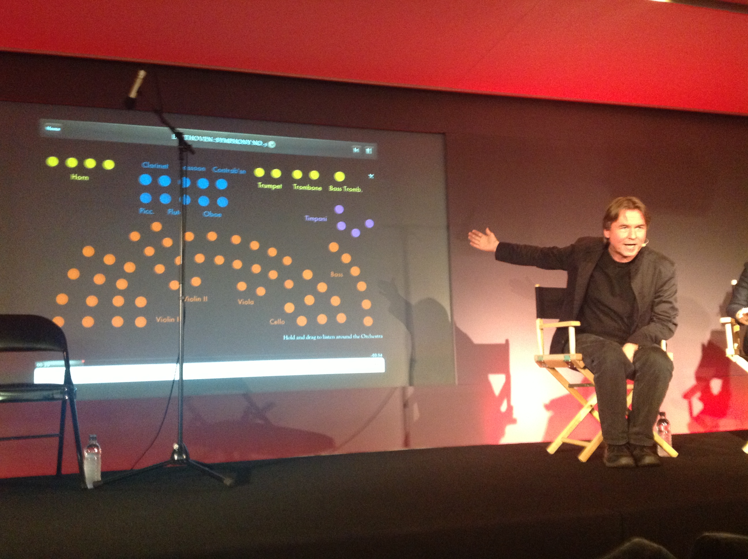
at the product launch at the Apple store in
London (14 December 2012)
The size of the iPad imposes an important limit to the amount of score and video that can be displayed at the same time. To address this, instead of the full score, one can view a “curated” score that only shows the important instruments at every given time (not necessarily all those playing). This is a clever mechanism that immediately visualizes changes in the orchestra’s texture, but instruments (or rather, their staves) jumping in and out of view make it uncomfortable to actually follow the score. A special sequencer-like view can replace the score. This, I believe, is a great aid for the non initiated: it immediately shows the complexity of the music.
Audio commentaries (or their transcriptions) can be switched on to accompany the user/listener through the piece. Salonen’s commentaries will occasionally refer to a piece’s history; performers’ comments tend to stick to the practicalities of performances, often quickly moving away from the context piece being heard.
Extra educational content is quickly reachable from the home screen or from the score. There is a profile for each instrument, with a photographic 3D-model (a signature feature of TouchPress apps), short video explanations by the performers and an interactive piano to sample the instrument range and timbre. There are also introductions to each piece, also targeted to the interested, but untrained reader (an amusing yet communicative example is in the commentary on Beethoven’s fifth, where the famous opening is referred to as “the ta-ta-ta-TAH“).
The relative precision of alignment between the different media reveals a closely curated publication, where human-produced metadata is key (for example by recording someone’s “tap” to get tempo information). The aim here is to publish fewer minutes of music, but at the highest possible quality; everything is edited so automatic cross-media alignment, in brief, is probably out of the picture (or only used as support).
The scores, however, are perhaps the least curated components of the app. They are supposed to be the same as those used by the orchestra in preparing the performance and it is even possible to spot the odd editorial intervention (use of square brackets and dotted lines, mostly), however there is no explanation of what the marks mean or why they are there. Clearly, the focus of this app is on the orchestra as a coherent music-making group, while it is not a means of discovering the musical works themselves.
This shows a departure from other TouchPress titles based on literary works, for which an exemplary publication is The Waste Land. The app publishes T. S. Elliot’s work together with annotations, images of the manuscripts, video interviews to experts, and a full performance by Fiona Shaw. While in The Orchestra the works and their texts (the scores) act as nothing more than starting point, in The Waste Land the focus is strongly on the text.
Those scholars in the Digital Humanities interested in digital scholarly editions were quick at noticing the example set by The Waste Land. Mark McDayter wrote an extensive review on his blog and Elena Pierazzo reviewed it in a few talks. Both praise the innovation and point out the same issue: it is not a scholarly edition of the work; should it be, and how?
The costs for producing these beautiful publications also seem relatively high for academic-led projects; The Waste Land costed $120,000 in the making (source: BBC). Does this mean that scholarly digital editions are to remain a below-par product visually and functionally? Can software like Scalar help?
In the context of digital editions of music, TouchPress shows what can be done with today’s digital publishing platforms. Nonetheless, the strong focus on the orchestra itself does not work well for scholarly editions, which are by definition text-centric. This does not mean that the two approaches cannot be united: one can imagine The Orchestra enriched with a more interactive score with connections to the explanation of editorial marks and extra content about the “making of” the text. What is hard to image, though, is making the scores performable. Issues with the size of the hardware are already evident for listener-oriented fruition, and TouchPress (or Music Sales for them) has not even began dealing with individual parts.
The Orchestra is a unique piece of work and an example for the Digital Humanities community with interests in music editing and publishing. Many a project have attempted to show the communicative power of multi-modal alignment, for which good examples are the Probado Music Document Interface (see also this paper) and the experiments with aligning score, performance and scholarly commentary at Purcell+ (alas, the demo is not publicly available). Nonetheless, The Orchestra‘s carefully designed user interface and curated content really shows the potential of this medium. A next essential step is achieving this quality in delivery for scholarly projects and performer-oriented editions (though the iPad might not be the best device, for more details have a look at one of my previous posts)